Charuta Kulkarni

What's D Move?

An event planning application to plan where, when, and what collaboratively.

#Client Project
#UX Design

#UI Design

Overview
What’ s d Move is a social networking mobile app that aims to help people make plans collaboratively with friends and family. It reduces the number of applications people use to make plans like messaging, expense splitting, media sharing, and exploring and brings everything under one unique app.
Project goal
The main goal is to reduce the hassle of going back on forth when making a plan and reduce the burden of planning and managing that generally falls onto one person. With such a user-centric product, designing an easy, inviting, and friendly experience was pivotal.
my role

Product Designer

project duration

10 Months

My responsibilities

Ideation, Designing, Prototyping, Branding, Strategizing MVP, Collaboration with Development Team, Business Analyst, and Social Media Manager, Testing. 

feature 1
Plan to hangout with friends easily without the hassle of texting or calling to check their availability. Just see who is available and get going!
feature 2

Explore local places and events in your neighborhood and city that generally go unnoticed.

feature 3
Help businesses grow by getting discovered directly by customers.

PROJECT TARGET AND DESIGN PROCESS

Working in an agile environment, our team was tasked to build the minimum viable product to pitch to the investors and test the product fit with the early adopters. Additionally, the app needed to be friendly, easy to use, and finish setting up hangout/plan in less than 3 clicks.

DESIGN PROCESS

PHASE 1 - IDENTIFYING PROBLEMS WHEN PLANNING IN-PERSON EVENTS

CHALLENGES FACED BY THE BUSINESS

We surveyed over 500 participants to get feedback about the problem they face when planning an event:

  • On average, participants used five (5) applications for planning, executing, and managing an event. Application for messaging, bill splitting, photo sharing, and exploring.
  • 90% of the participants faced challenges co-ordinating and communicating the specifics of an event. 
  • 3 in 5 participants felt that the burden had to carry the burden of planning for the entire group. Most of them felt managing in-person social events is a cumbersome. 
OPPORTUNITY

We identified core areas where  planning an in-person hangout can be made better: 

  • Finding out availability and
  • Collaboratively planning using tools like voting, smart explore, and smart availability feature.

THE KEY QUESTION THE APP WILL SOLVE

How can we enable hassle-free planning of the when, where, and what of in-person events?

PHASE 2 - DESIGN AND INITIAL DESIGNS

DESIGN DEVELOPMENt

With the elements like social networking, communication, exploration, and planning, we held three (3) design sprints followed by wireframes and low-fi mock-ups to get a tentative idea of how the app would look and feel.

Some design elements:

  • Flows are to be completed with less than three clicks.
  • Easily editable plan specifics
  • Clear categorization of the type of events,
  • Easy drag and drop of tools like add polls, suggest places, etc.
  • Friendly, clean, and spacious


Additionally, the users of this app are in the older age group and are not tech-savvy. So, we decided to create a portal that will mimic their current processes.

INITIAL LOW FIDELITY PROTOTYPE – PASS 1

INITIAL LOW FIDELITY PROTOTYPE – PASS 2

PHASE 3 - MINIMUM VIABLE PRODUCT & DEVELOPMENT PHASE

DESIGN DEVELOPMENT

With the elements like social networking, communication, exploration, and planning, we held three (3) design sprints followed by wireframes and low-fi mock-ups to get a tentative idea of how the app would look and feel.

Some design elements:

  • Flows are to be completed with less than three clicks.
  • Easily editable plan specifics
  • Clear categorization of the type of events,
  • Easy drag and drop of tools like add polls, suggest places, etc.
  • Friendly, clean, and spacious


Additionally, the users of this app are in the older age group and are not tech-savvy. So, we decided to create a portal that will mimic their current processes.

LANDING PAGES & EMPTY STATES
The main functionalities could be easily accessed from the landing screen. The goal was to give users as much flexibility with minimum clicks. The empty state screen nudged the users to take the next steps.
ICON & SPLASHSCREEN DESIGN

The app icon and splash screen were designed following the human-interface guidelines provided by Apple

COLLABORATIVE EVENT PLANNING
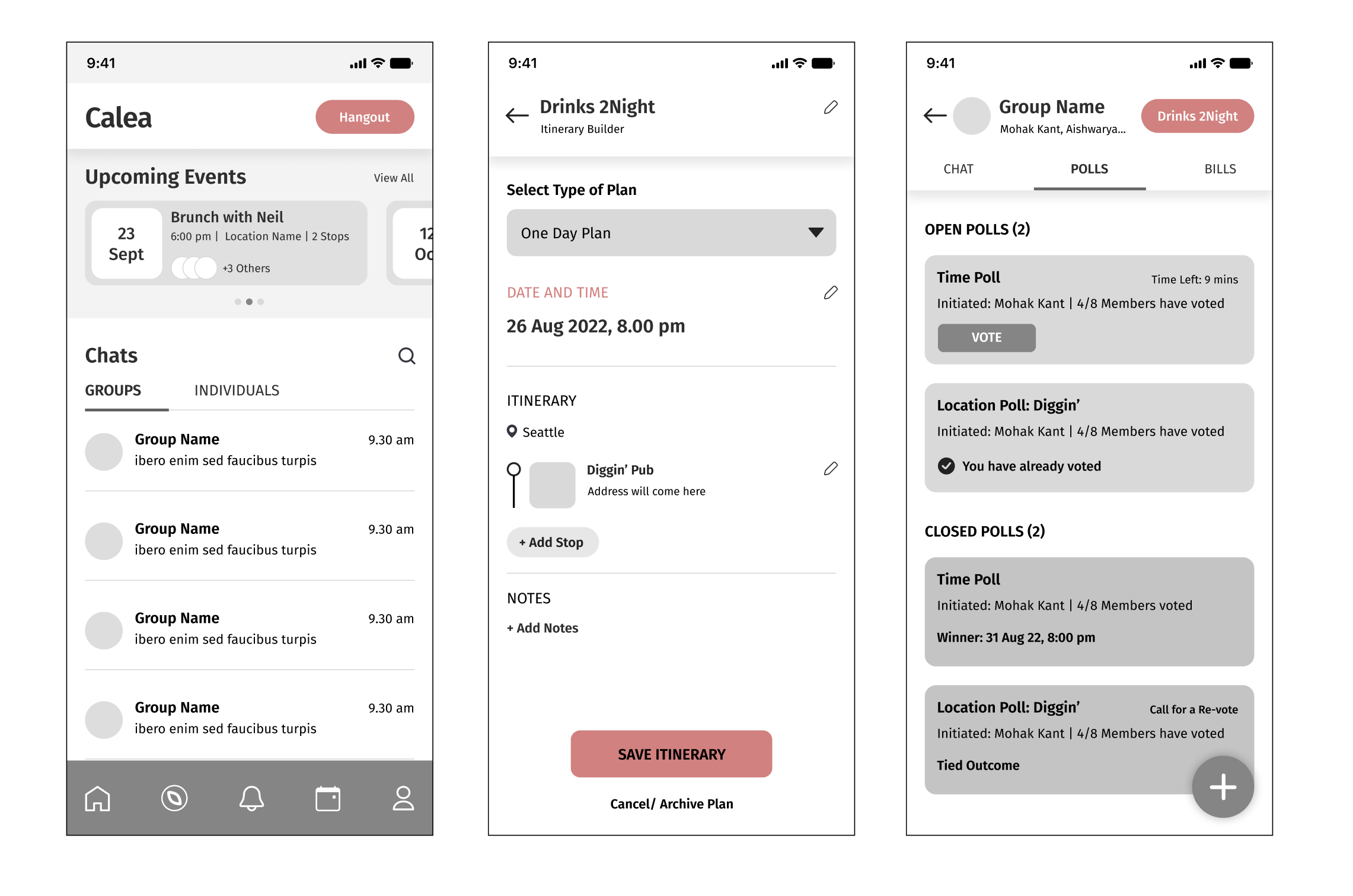
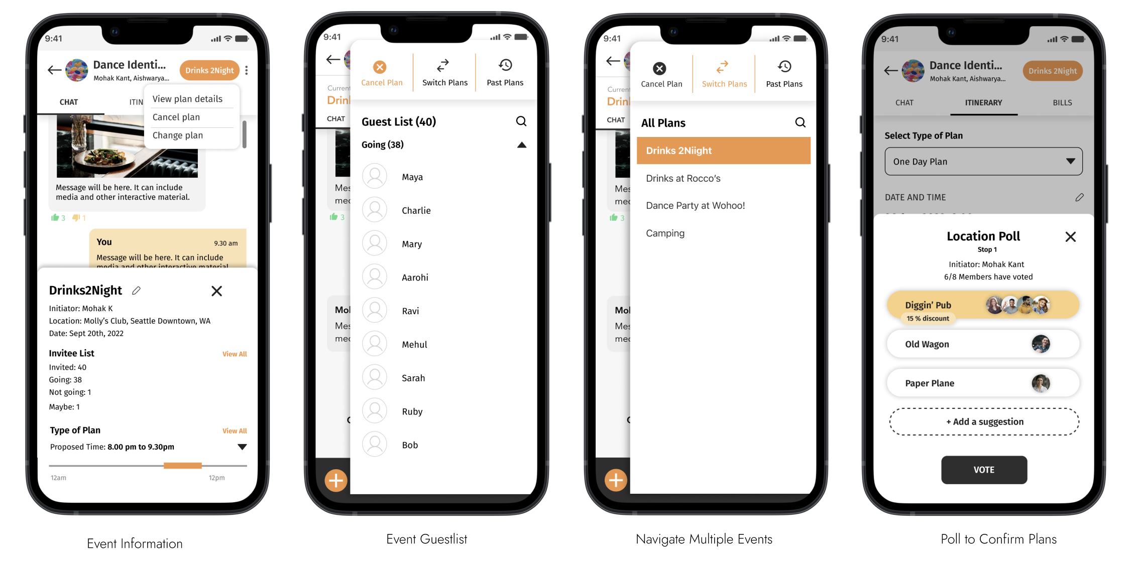
The screens below show snapshots of messaging, switching plans, and polling features. Following the theme of keeping everything easily accessible, number of click were reduces as much as possible.

EXPLORE LOCAL EVENTS

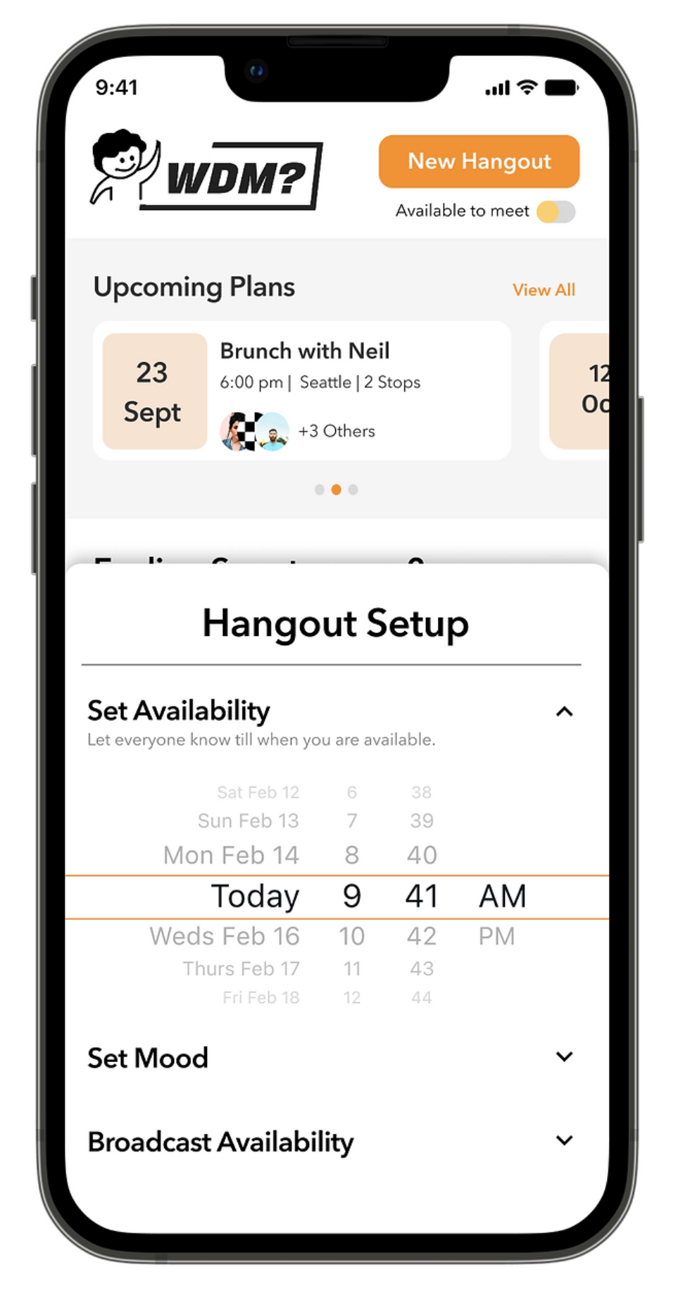
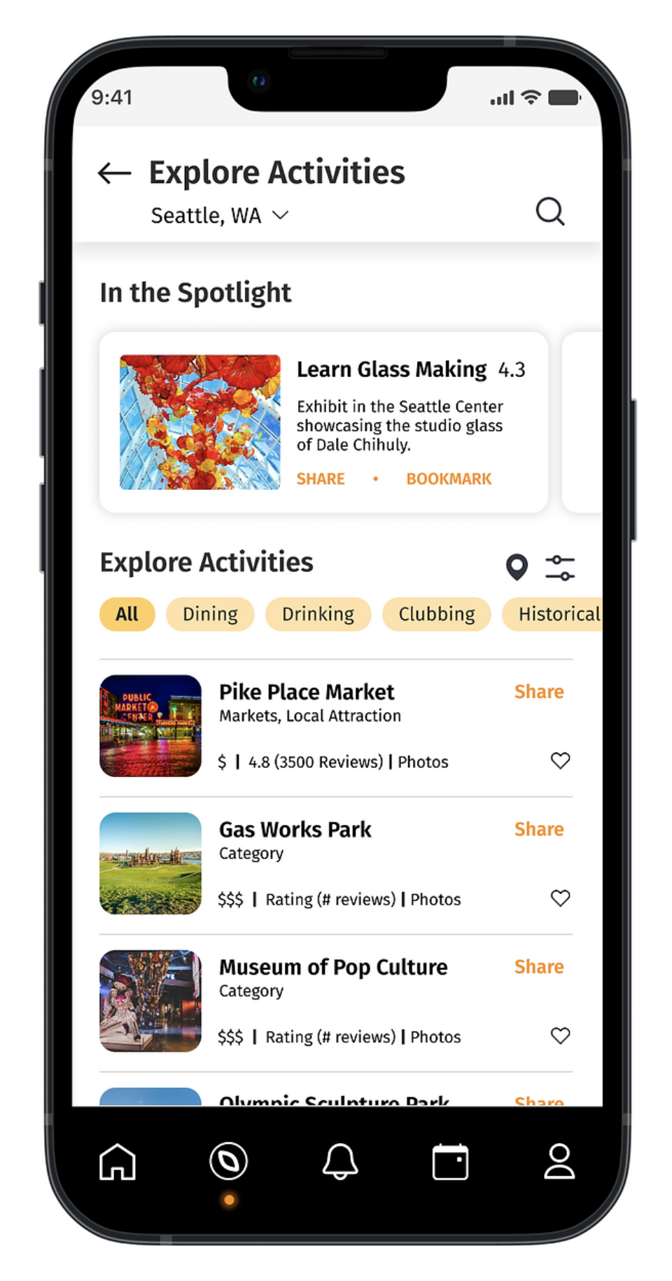
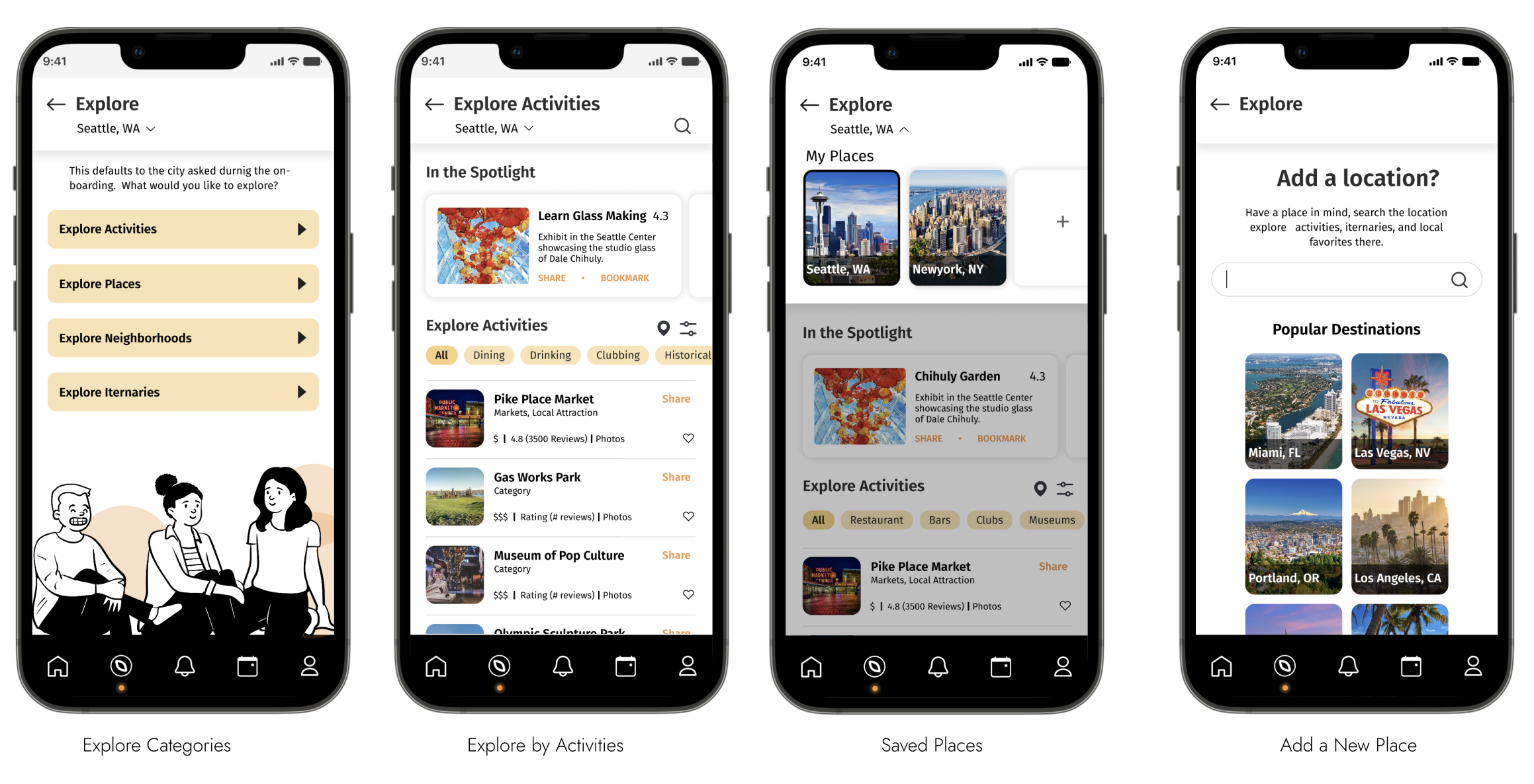
We provided users with various categories to explore places. They could view places based on the type of activities, neighborhoods, and number of trip days. They could also set their frequently visited cities, home towns to get notified of the events nearby. Additionally, we also provided an option to add place to the poll that are on the on-going planning.

BASIC APPLICATION FUNCTIONALITIES

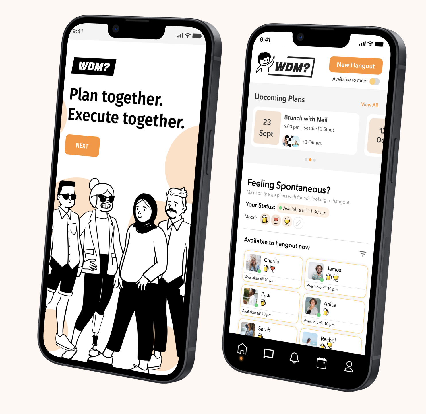
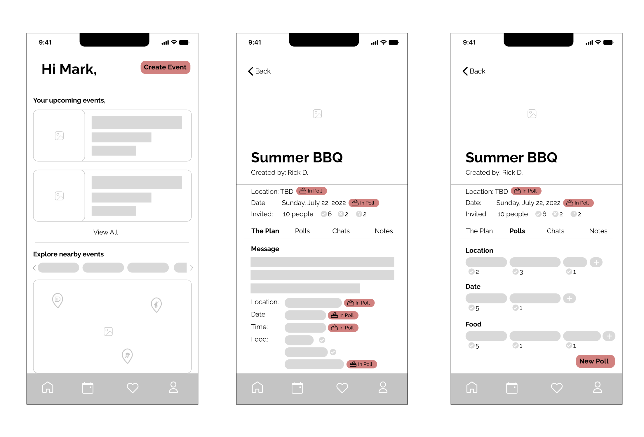
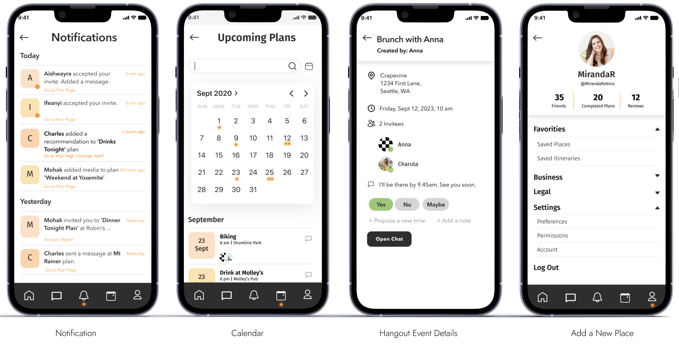
Primary functionalities of notification, calendar and profile are accessed through the bottom navigation. These functionalities, crucial to planning and updates of an event planning application, were located to be easily accessible to the user.

OUTCOMES AND ACHEIVEMENTS

Our team was successful in delivering:

  • The design and high-fidelity prototype of the minimum viable product.
  • Redesign of product website.
  • Social Media campaign.
  • Providing all the deliverables needed to apply for Seed funding at Y-Combinator.