Charuta Kulkarni

Simpl.RE

A one-stop application that makes real estate development approvals simpler.
#Concept Project
#UX Design

#UI Design

Overview
Real estate development projects need entitlement approvals from the city they are located. This approval process is often slow, unpredictable, and expensive for all stakeholders involved. With this project, I am looking to find how can we make this process simple and efficient for all stakeholders involved.
Project goal
To validate the potential business opportunity by designing and testing the application with target users.
my role
Product Designer
project duration
4 Months
My responsibilities
Ideation, User Research, Sketching, Userflows, Wireframes, Prototyping, Usability Testing,
HUMAN-CENTRIC APPROACH BY CONDUCTINg
feature 1

Track project status and progess

feature 2
Manages entitlement review process.

feature 3

Smartly identifies local code and regulation

DESIGN PROCESS

STEP 1 - DISCOVERING THE PROBLEM

CHALLENGES IN THE APPROVAL PROCESS AFFECT REAL-ESTATE BUSINESSES & HOMEOWNERS ALIKE.
Every year many Americans undertake home improvement or design projects, which generally require homeowners and real estate experts to get city approvals. These processes (a.k.a. entitlement processes) tend to be complex and unpredictable. The opaque and often unpredictable nature of entitlement processes leads to significant budgeting and scheduling issues for all stakeholders involved. Here is an example:

ASSUMPTIONS BASED ON FIRST HAND EXPERIENCE

After working in the field of architecture for 8+ years, I realized that even though each project presented unique design requirements, getting projects done often involved complicated approval processes. Inefficiencies in the approval process led to delays and budget issues.

As a budding Product Designer, I was curious to find design-focused solutions for this vast problem space and explore potential solutions.

COMPETITIVE ANALYSIS

Through competitive analysis, I discovered there isn’t a single product that comprehensively addresses the problem.Due to the lack of products in this space, I performed heuristic analysis of several city websites:

Development Tracker:

City of Sacramento

Development Tracker:

City of Victoria

Development Tracker:

City of Nashville

Heuristic 1

Data transparency and clarity of use

Easy to follow and clearly shows the project status & latest activity. Detailed timeline makes it easy to read.

Easy to follow and clearly shows the project status & latest activity. Detailed timeline makes it easy to read.

Easy to follow and clearly shows the project status & latest activity. Detailed timeline makes it easy to read

Heuristic 2

Aesthetics and minimal design

Easy to follow and clearly shows the project status & latest activity. Detailed timeline makes it easy to read.

Easy to follow and clearly shows the project status & latest activity. Detailed timeline makes it easy to read.

Easy to follow and clearly shows the project status & latest activity. Detailed timeline makes it easy to read

Heuristic 3

User control and freedom

Easy to follow and clearly shows the project status & latest activity. Detailed timeline makes it easy to read.

Easy to follow and clearly shows the project status & latest activity. Detailed timeline makes it easy to read.

Easy to follow and clearly shows the project status & latest activity. Detailed timeline makes it easy to read

Heuristic 4

Match between system and real world
The landing page aligns with how a user would search for projects. The data is displayed in logical and natural way

Easy to follow and clearly shows the project status & latest activity. Detailed timeline makes it easy to read.

Easy to follow and clearly shows the project status & latest activity. Detailed timeline makes it easy to read

IDENTIFYING THE POTENTIAL USER GROUPS
Simpl.RE is applicable to all of the architecture, engineering, and construction (AEC) industry, which includes a wide range of user groups:
I wanted to crisply define the end-user, so for the first generation of Simpl.RE, I focused on the user groups architects/developers and homeowners, because they incur the highest costs.
IDENTIFYING THE POTENTIAL USER GROUPS
To validate my assumptions, I reached out to five (5) participants to find if they were experiencing similar issues. To keep he focus on the users, I used the interview responses to create user personas.
PERSONA 1

Architect / Real Estate Developer

PERSONA 2

Homeowner

STEP 2 - DEFINING THE PROBLEM SIMPL.RE WILL SOLVE

INSIGHT AND BUSINESS OPPORTUNITIES THROUGH USER FEEDBACK

THE KEY QUESTION THE APP WILL SOLVE

How might we make the real estate approval processes more clearer, predictable, and efficient?

STEP 3 - DESIGNING THE FEATURES, NAVIGATION AND IDEATION

IDENTIFYING & PRIORITIZING FEATUREs
I categorized user needs into eight sections to inform ideation and feature development.
Product features using user needs
PRIORITIZING FEATURES THAT PROVIDE CLARITY
The list of potential features expanded quickly. To narrow down the focus, I decided to focus only on the high-priority features and define the minimum viable product.
Defining the first generation of Simpl.RE
DESIGN CHALLENGES – MANAGING COMPLEXITY
SKETCHING USER JOURNEYS

User Journey 1 – Creating New Project

User Journey 2 – Requesting Project Review

STEP 4 - PROTOTYPING

RE-ITERATING THE DESIGN

I went through two design cycles before finalizing the UI

  • Even though the first iteration functioned well, it was not intuitive and looked static.
  • I studied several industry products such as Procore and Dropbox. The product whose user flow resonated the most was TurboTax.
  • The redesign of Simple.RE was focused on an interactive and intuitive experience
FIRST ITERATION – MID FIDELITY PROTOTYPE

CREATING THE DESIGN SYSTEM 

STEP 5 - USABILITY TESTING

USABILITY TESTING – ROUND 1

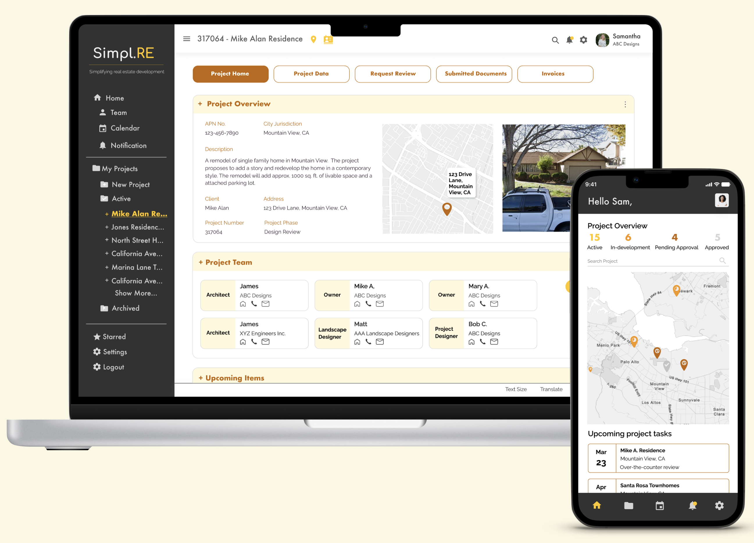
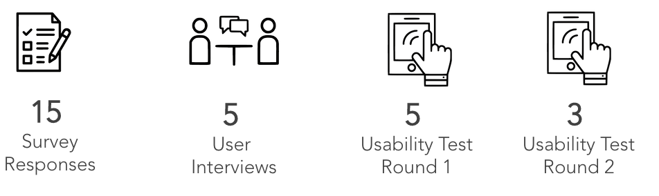
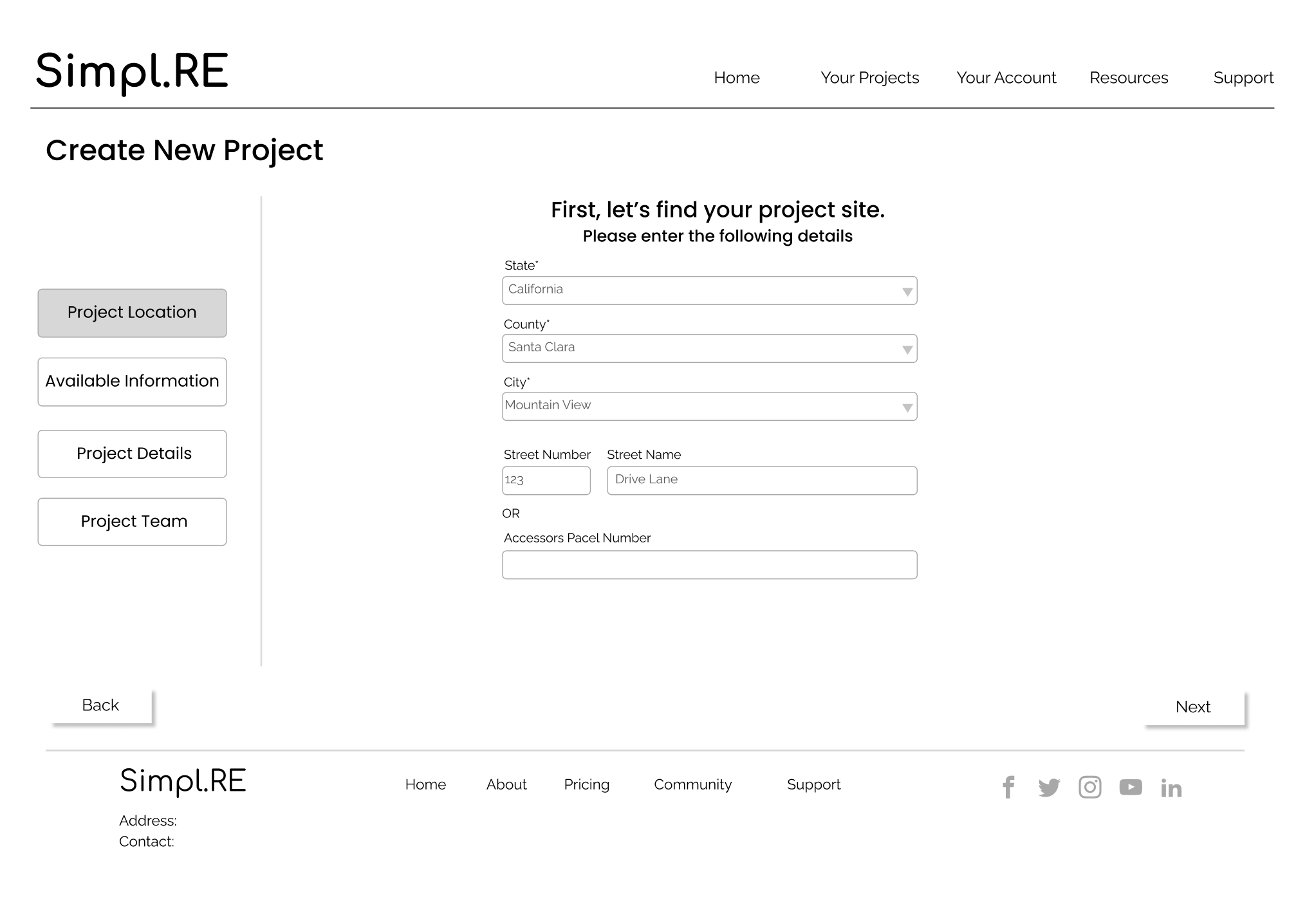
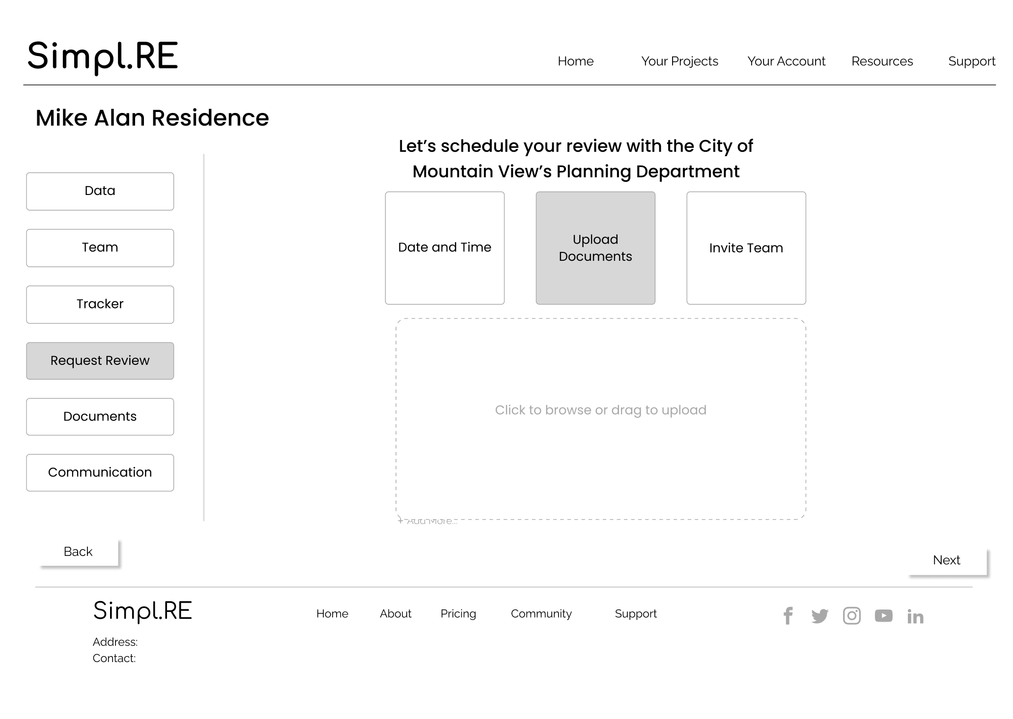
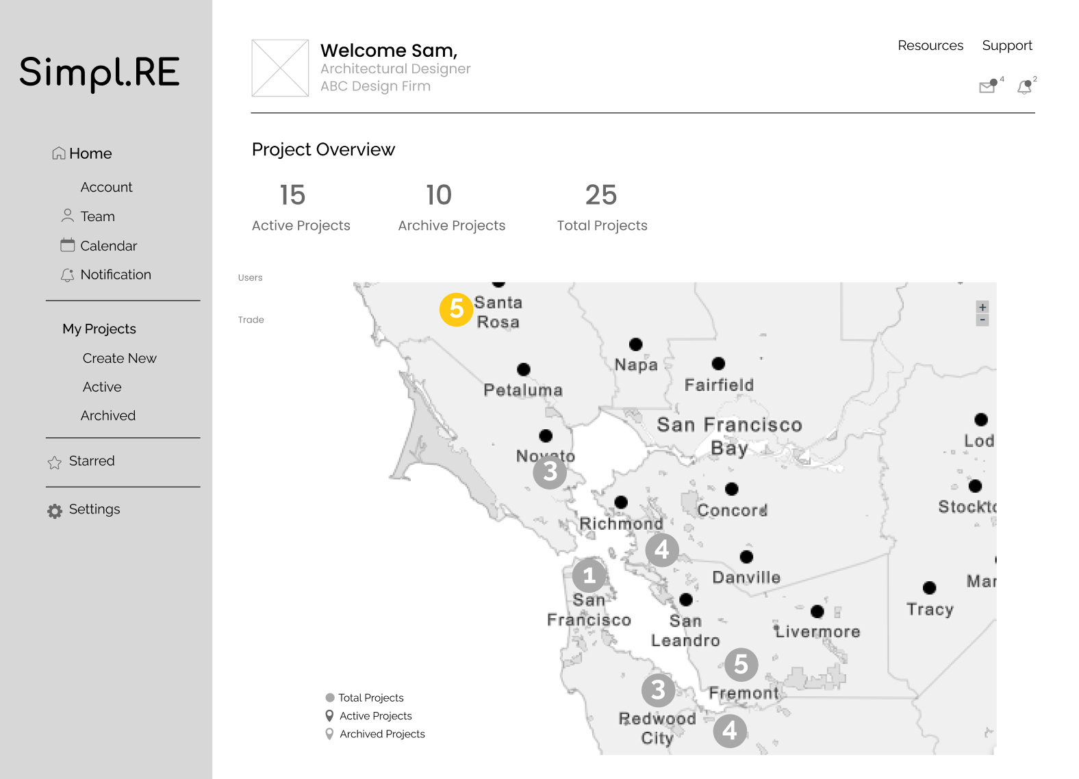
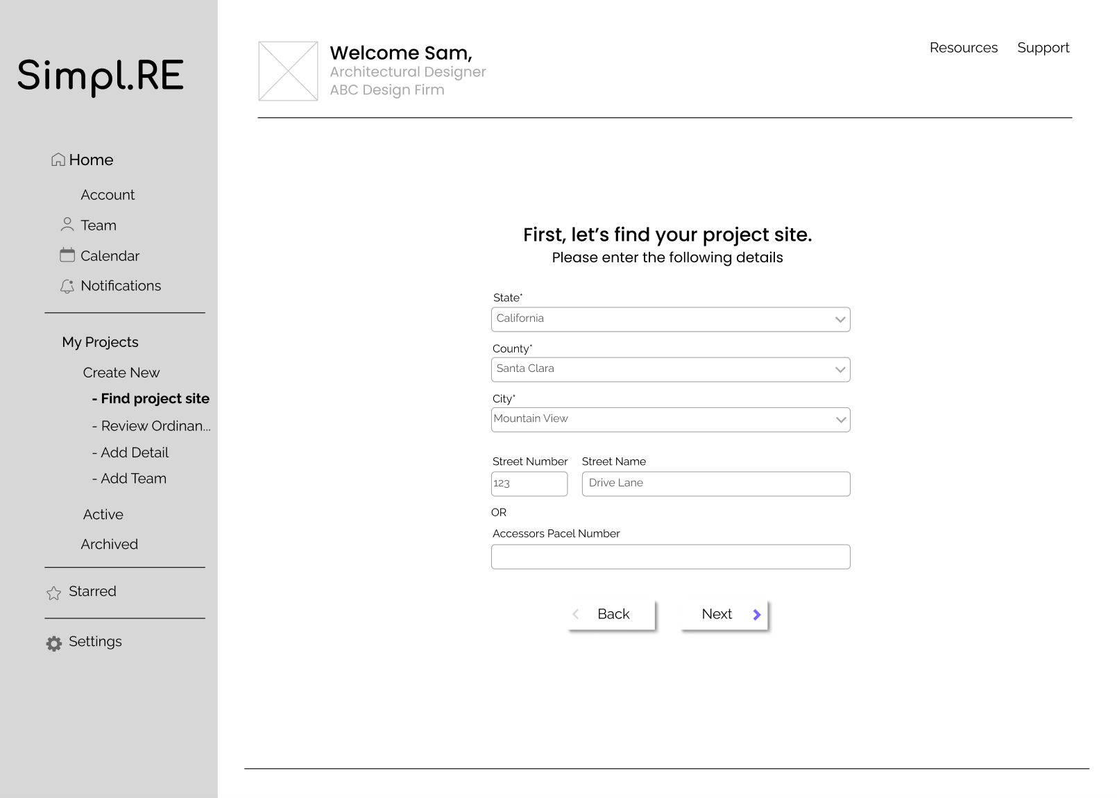
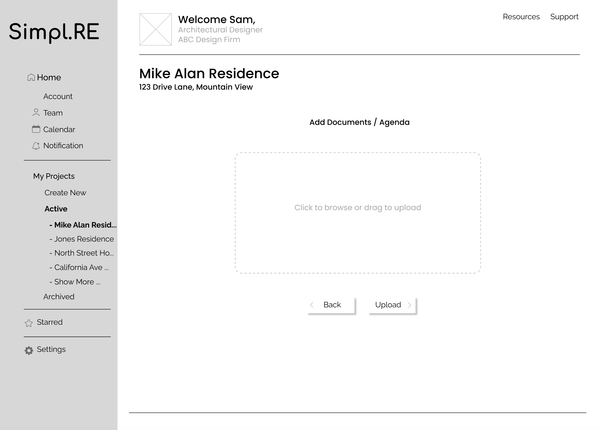
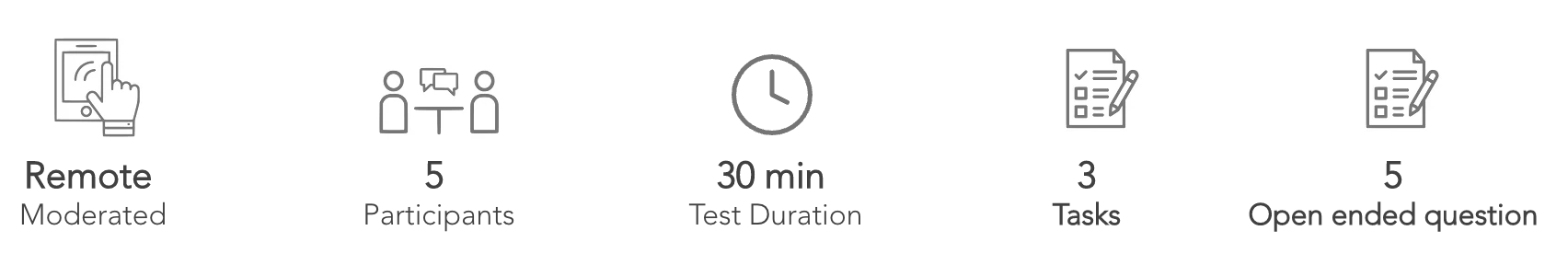
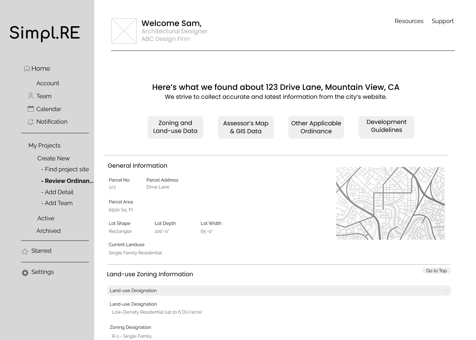
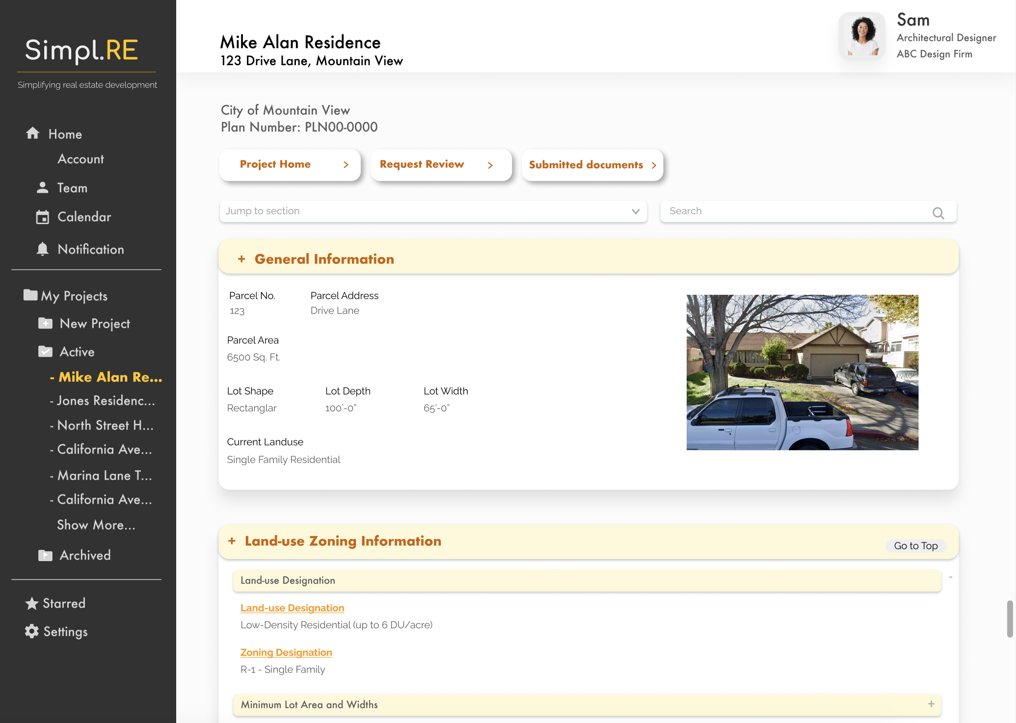
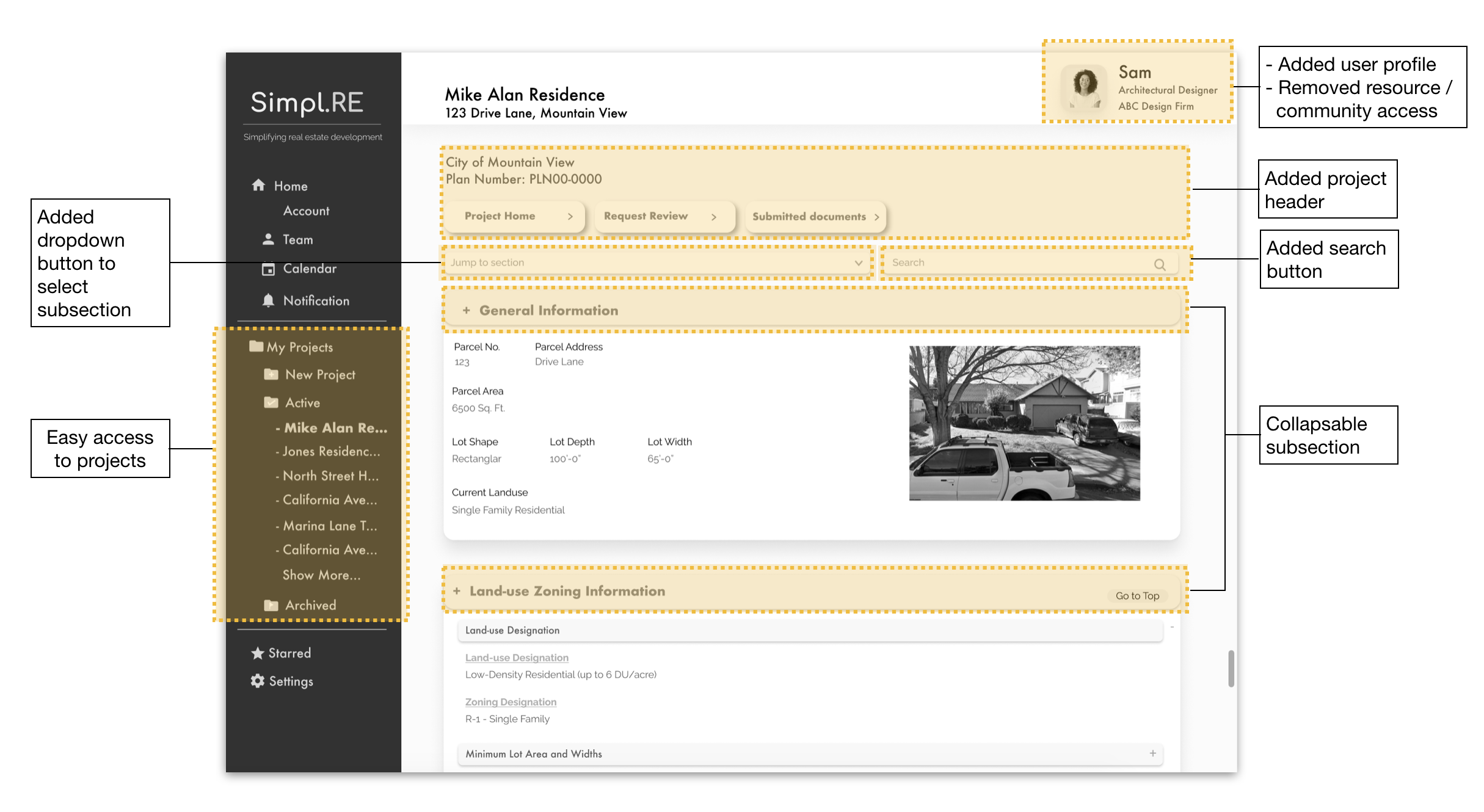
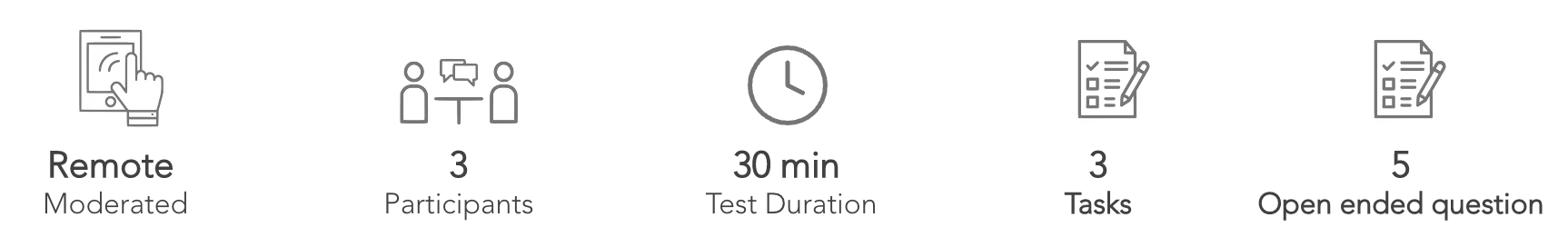
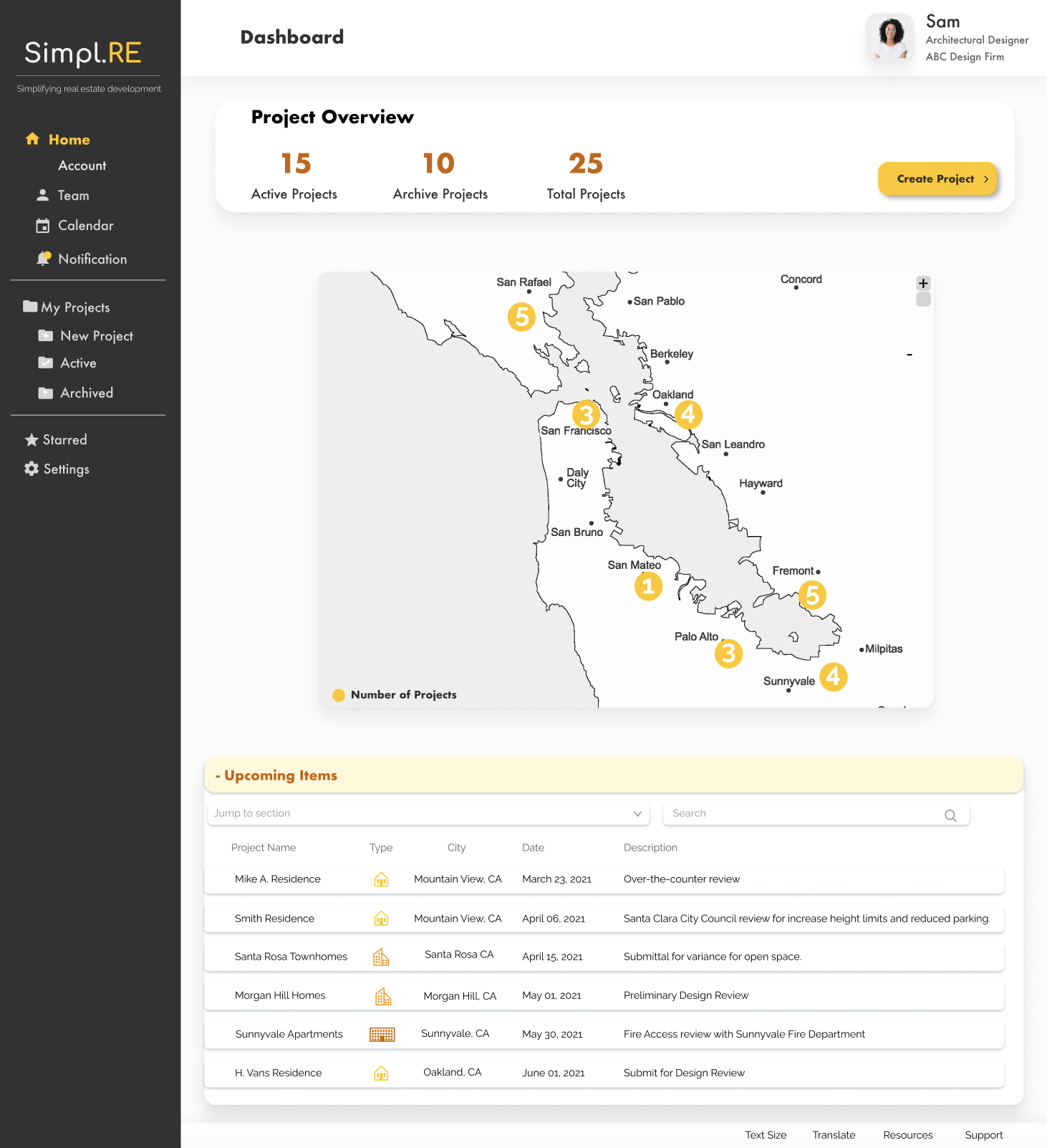
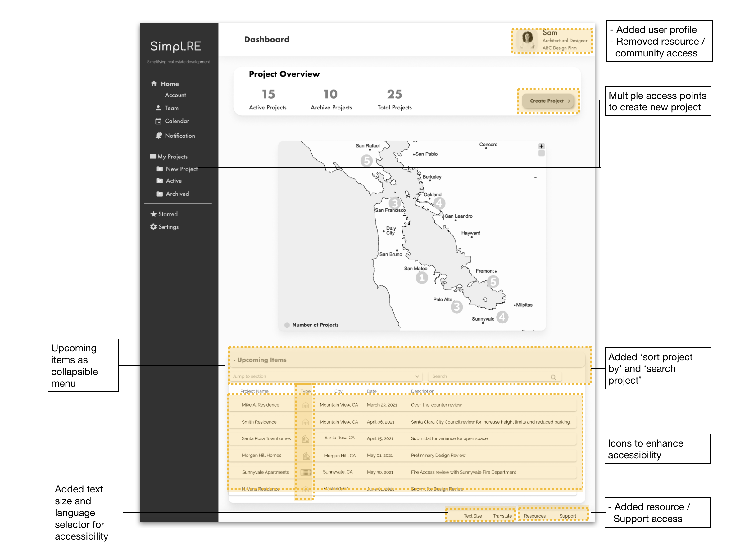
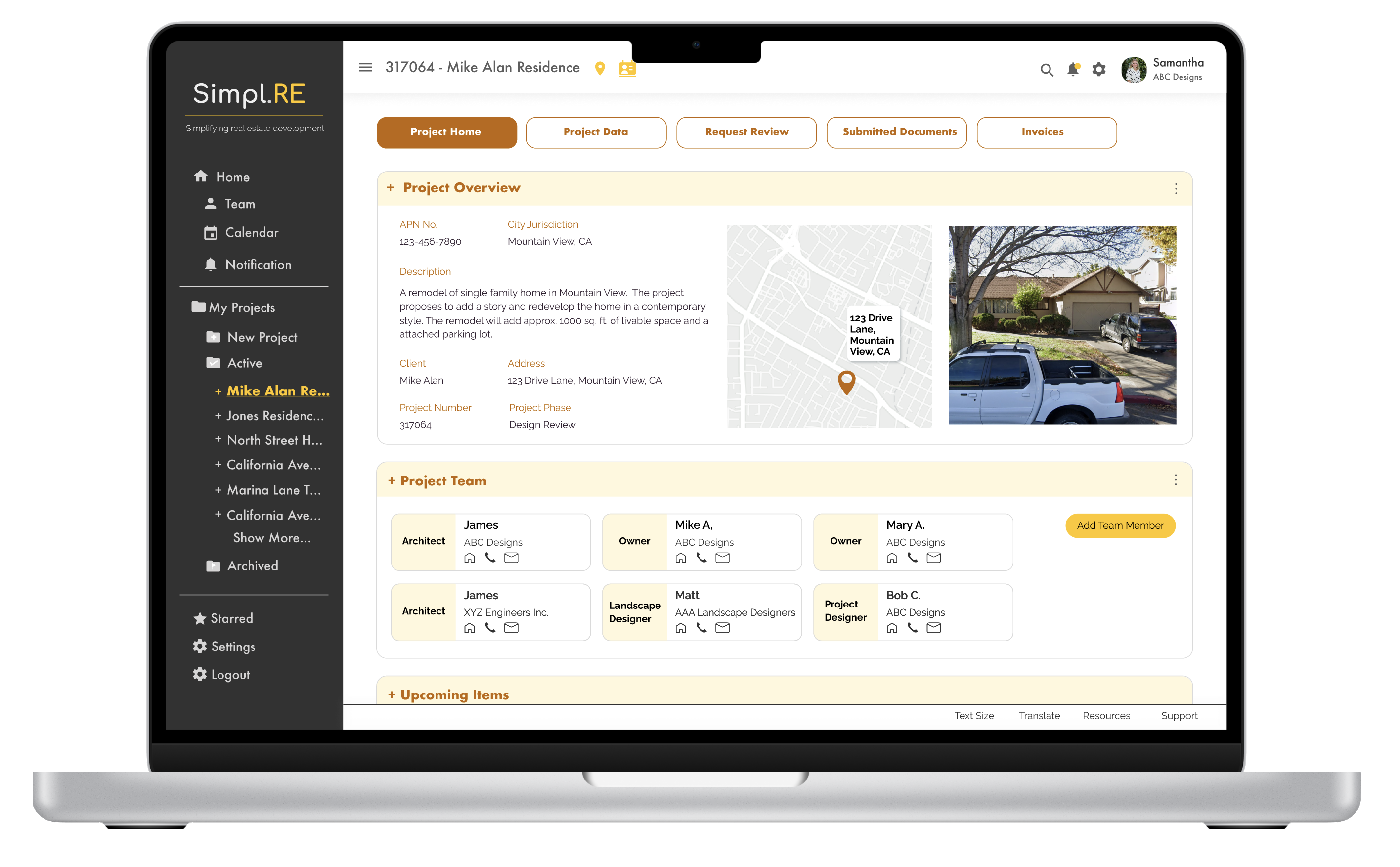
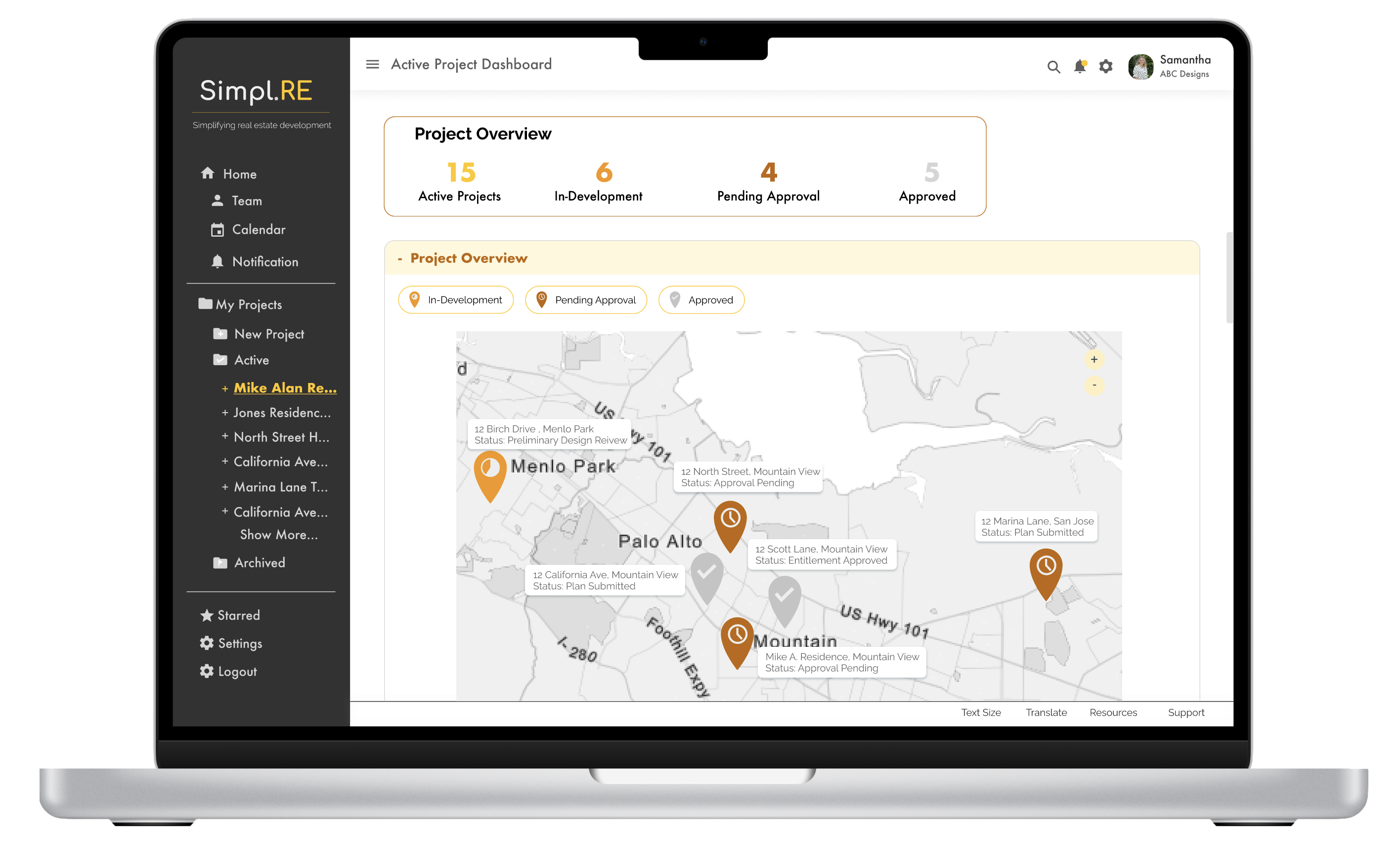
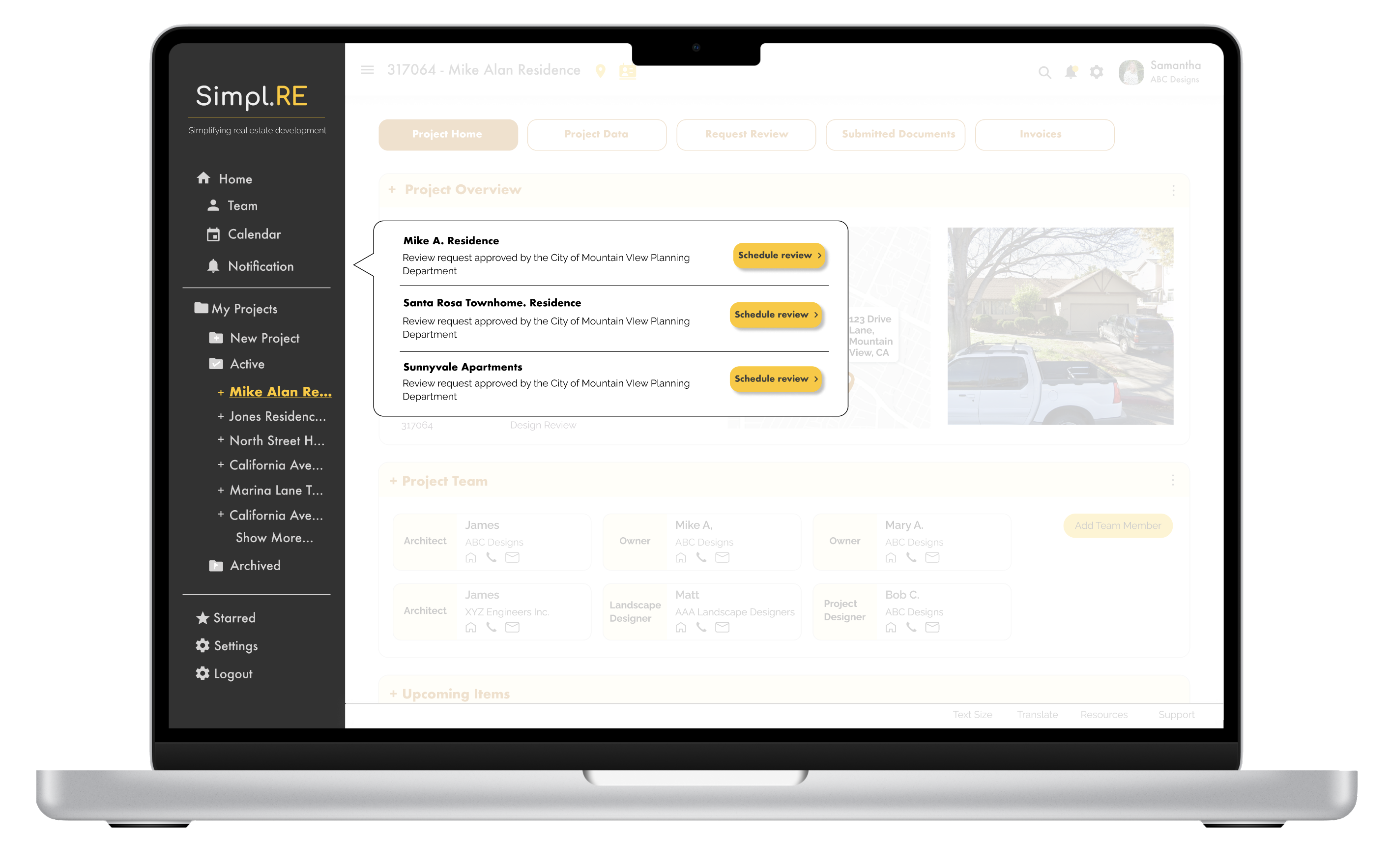
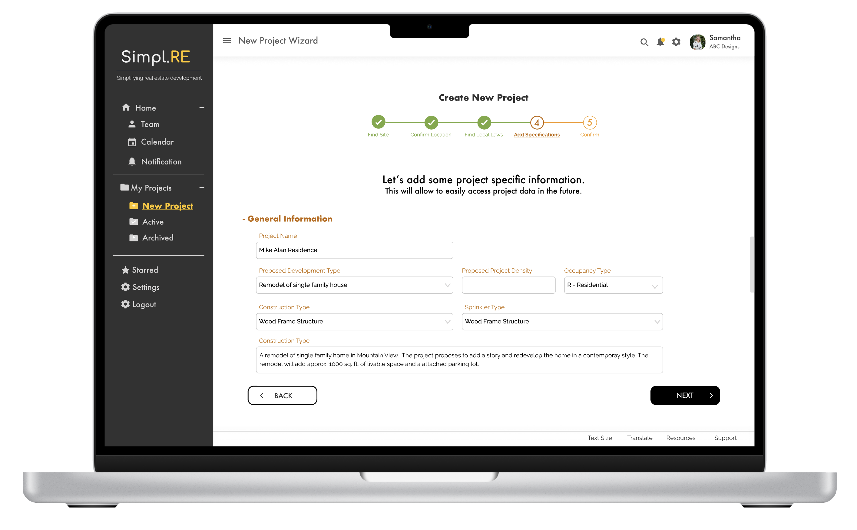
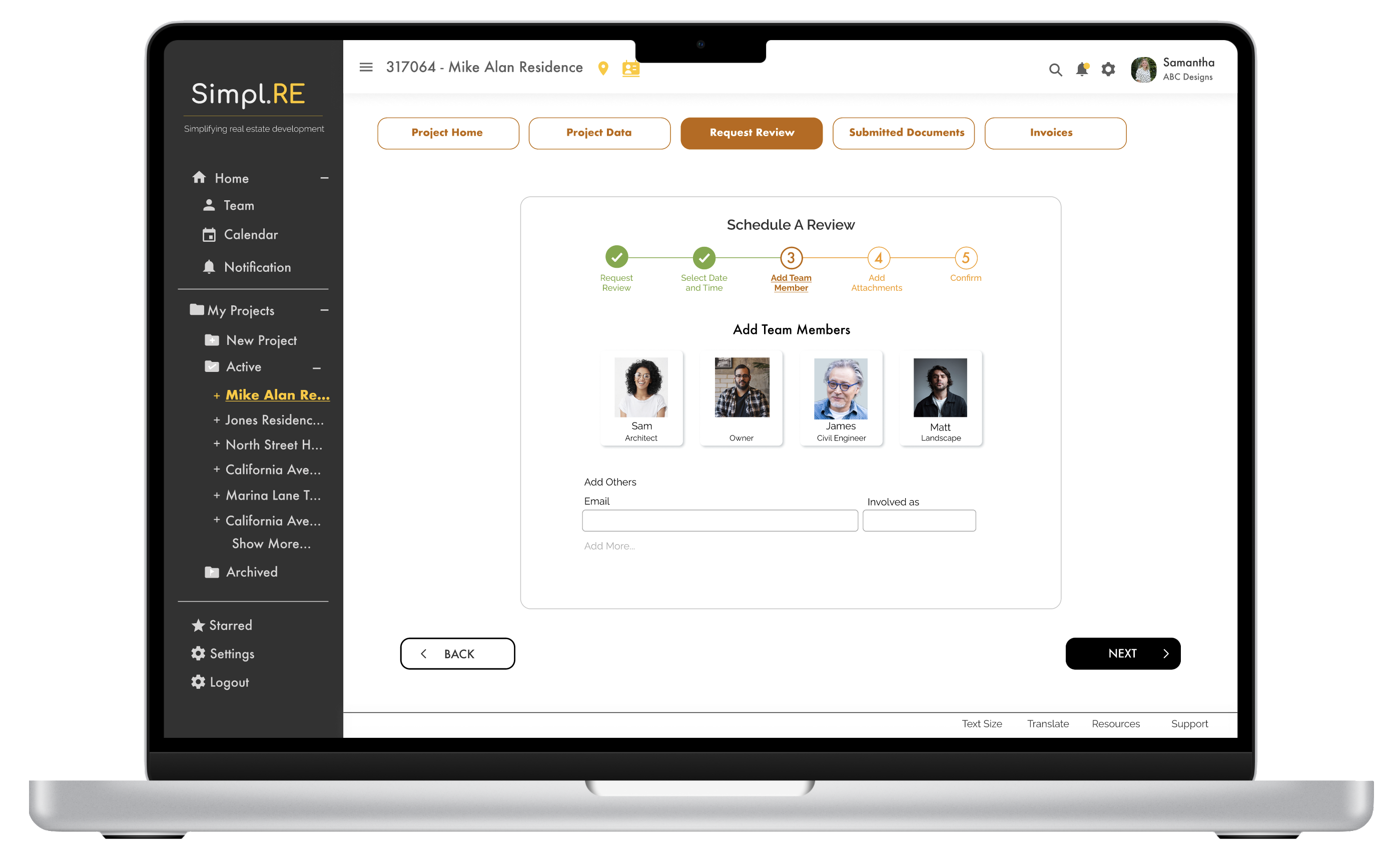
Experimenting with a new space, it was crucial to understand what the users felt about the application. The user responses also helped me gain insight into the product-market fit. Some of the questions I asked included, Did they find it useful? Can this product help simplify your day-to-day work processes?  I reached out to five (5) participants in the AEC industry, some of whom were part of the user interview, Overall, users were excited about the solution and could see themselves using the application on a day-to-day basis. The test also revealed some limitations while performing the tasks. 

PAINPOINTS

  • Users were not able to find the exact information asked in the questions.
  • Due to the information-heavy and long regulation page, users were getting lost when scrolling through the page.
  • When on the project page, the users wanted some basic information like the project name and application city & number to be always upfront.Users found completing the first task challenging.
  • The users were asking for more features that would automate the processes in their everyday workflows.

INSIGHTS 

  • Different cities/codes use different terminologies to showcase information. Users needed help finding codes.
  • Longer the page leads to more scrolling which discourages users from engaging.
  • Navigating through the application was a steep learning curve for the users.

RECCOMMENDATIONS

  • Add a search field at every possible opportunity.
  • Make succinct pages by creating collapsable sections.
  • Create a project sub-heading that will be consistent across all the pages.
  • Add tutorials/quick how-to snippets for every feature.
Navigation experience – Before and After
Revision summary

USABILITY TESTING – ROUND 2

This was the final round of usability testing for this generation of Simpl.RE. 

PAINPOINTS

  • Some users were having a hard time reading text, icons, and buttons
  • Users pointed out that the entry point to creating a new project was getting lost and was not intuitive.
  • Users were having issues reaching the scheduling page. 

INSIGHTS 

  • Having multiple entry points for various tasks and project folders provides flexibility in navigation. 
  • The age group for target users includes the young as well as the older population. We need to integrate accessibility.  ​​

RECCOMMENDATIONS

  • Add a search field at every possible opportunity.
  • Make succinct pages by creating collapsable sections.
  • Create a project sub-heading that will be consistent across all the pages.
  • Add tutorials/quick how-to snippets for every feature.

TASKS AND UPCOMING ITEMS

Revision summary

FINAL PRODUCT

NEXT GENERATION OF SIMPL.RE

The AEC & Real Estate Industry is in the early stages of technology adoption. This gives Simple.RE a long runway to expand in multiple directions. Here are a few potential areas:

LESSONS LEARNED

  • Operating in niche space.
Operating in a niche space, recruiting target participants for ethnographic research and usability testing was one of the biggest challenges I faced. I reached out to many groups, slack channels, and my professional network to find participants.
  • Keep the focus of solving central problems 

Being the only app that was improving processes in the real-estate approval spaces, there was a vast opportunity to tackle the problem from various fronts. Thus, the scope of the project grew quickly. I kept a user-centric approach which allowed me to focus on the problems that users faced the most. 

  • Integrating simplicity to complex & multi-step problem

Simpl.RE provides various features that simplify the complex real-estate approval process. Finding codes that change from city to city, creating a portal for project review, project tracking, and document submission everything happens under the same roof. So, creating a simple yet intuitive design was a great challenge when designing this application. I learned it is crucial to have a clear and deep understanding of space to create an intuitive solution.