Charuta Kulkarni

Fundraiser Admin Dashboard

Fundraiser Management Dashboard for a Non-Profit Organization

#Client Project
#UX Design

#UI Design

Overview
Ruby for Good is a volunteer driver non-profit organization that provides software solutions to non-profits to bolster their critical missions. I was assigned a project with the Arlington, Virginia chapter of the international non-profit organization, Kiwanis International. The chapter organizes fundraiser events to provide lunches for school children.
Project goal
Design an admin dashboard to accelerate and automate Kiwanis Arlington Chapter’s Fundraiser event to enable faster per customer transactions and enhance back-end efficiency.
my role

UX/UI Design

project duration

3 Months

My responsibilities
Client co-ordinator, User Researcher,  Ideation, Prototyping, Testing, Cross-function collaboration.
feature 1
Modernized order tracking system with Stripe integration and management of new orders.
feature 2
Showcase detailed data-base of customers, orders, and payments.
feature 3
Communication portal to send notifications and updates about the fundraiser.

DESIGN PROCESS

STEP 1 - UNDERSTANDING PROBLEMS FACED BY THE ORGANIZERS

UNDERSTANDING AN EMPATHIZING WITH USERS

Our client has been organizing this fundraiser event for a few years now. The event that started as a small one has now grown into a big operation that requires a lot of organization and management. The increased scale and additional challenges due to the pandemic made the clients re-think their work processes.

  • Adapting to the pandemic with the social distancing guidelines, increased the wait time for the customers.
  • Long queues made people leave without participating in fundraiser, thus taking away the opportunity to raise money for the school lunches.
  • The back-end of the event was handled manually using methods like index cards or using basic software like excel to prepare for the fundraiser event.
OPPORTUNITY

Before our internal sync meeting, we identified two main areas that we thought would be most helpful to the clients.

  • Order status management
  • Data collection and management

STEP 2 - FINDING INSIGHTS

OPPORTUNITIES THROUGH FEEDBACK
We met the clients to get deeper insights from their experiences. I learned how fundraisers are held and what back-end activities and challenges are included.
“I manually sort index cards from orders to picked up box and color code if the payment is received or not.”
“It often happens that customers have same names. We need to create index cards with secondary information to identify the customer. Till all take lot of time on the back-end side.”
“People see a sign that there is this event and drop-by to get boxes. It’s very time-consuming to keep track on how much inventory we have, specially with many moving parts.”

ANALYZING FEEDBACK

The analysis of the client feedback pointed out that the most needed modernization was with the basic functionality i.e. managing the orders, pick-ups, and inventory management.

Add Items

Catalog

Virtual Basket

New Orders

THE KEY QUESTION THE APP WILL SOLVE

How might we create efficient and easy fundraiser organizer’s process so that it will reduce per customer transaction time.

STEP 3 of 5 - DESIGN AND PROTOTYPE

DESIGN DEVELOPMENt

As soon as we finalized the HMW, I wanted to understand how dashboards work, so I ventured out to websites like Envato to study live dashboards. Some of the major takeaways from my research:

  • Clear navigation for dashboard
  • Easily editable action flows.
  • Data prioritization that caters to user needs.
  • Clean and spacious UI.


Additionally, the users of this app are in the older age group and are not tech-savvy. So, we decided to create a portal that will mimic their current processes.

INITIAL LOW FIDELITY PROTOTYPE

STEP 4 of 5 - COLLABORATING WITH CROSS-FUNCTIONAL TEAMS

FEEDBACK FROM INTERNAL TEAMS
  • With the initial low fidelity mockup ready, I reached out to senior designers, developers and product managers at Ruby for Good to get initial feedback. They suggested:
  • Changing the individual tiles to a tablular format in order to achieve a clean UI.
  • Re-design the modals to occupy  complete screen to keep the focus on the task at hand.
  • Toggle buttons are used when an action changes status multiple times.  With order pick-up it is an one & done acton, so having the whole row clickable will make it easy to use.
  • On every page of the dashboard, I was trying to show feature tiles, which was not intuative. Initially, someone would have to study the tabulation would work to understand the tiles. (I later tested it with the client who had a similar response)
  • Over all increase the padding around text to make it visually pleasing.
IMPLEMENTING THE FEEDBACk

Before

After

Revision summary

managing trafeoffs

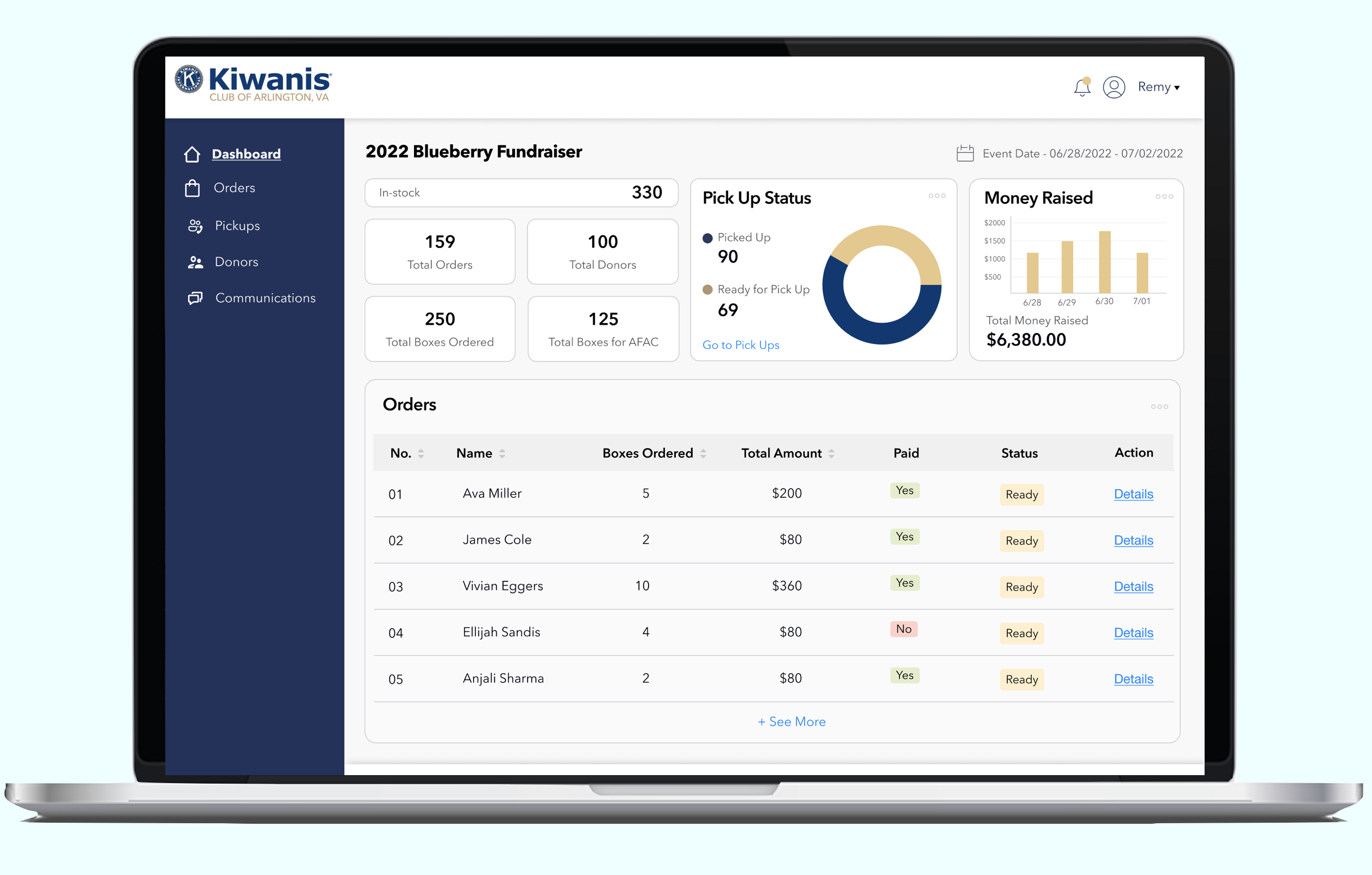
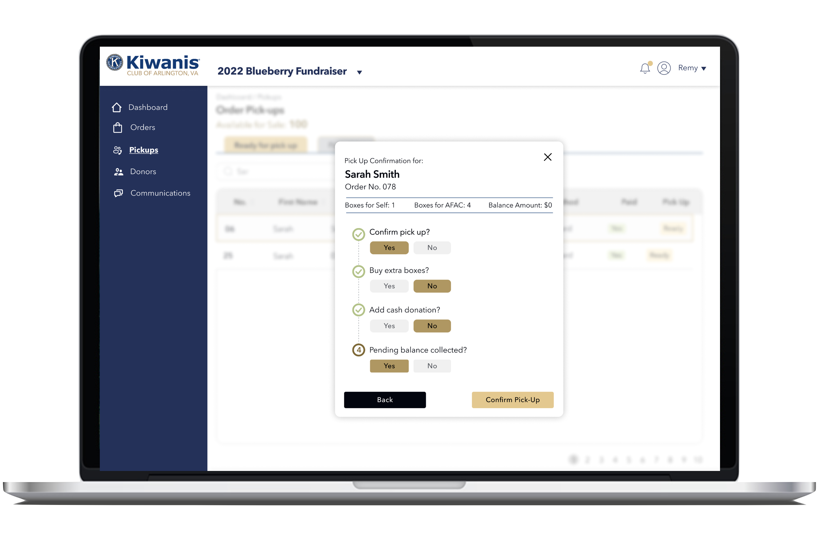
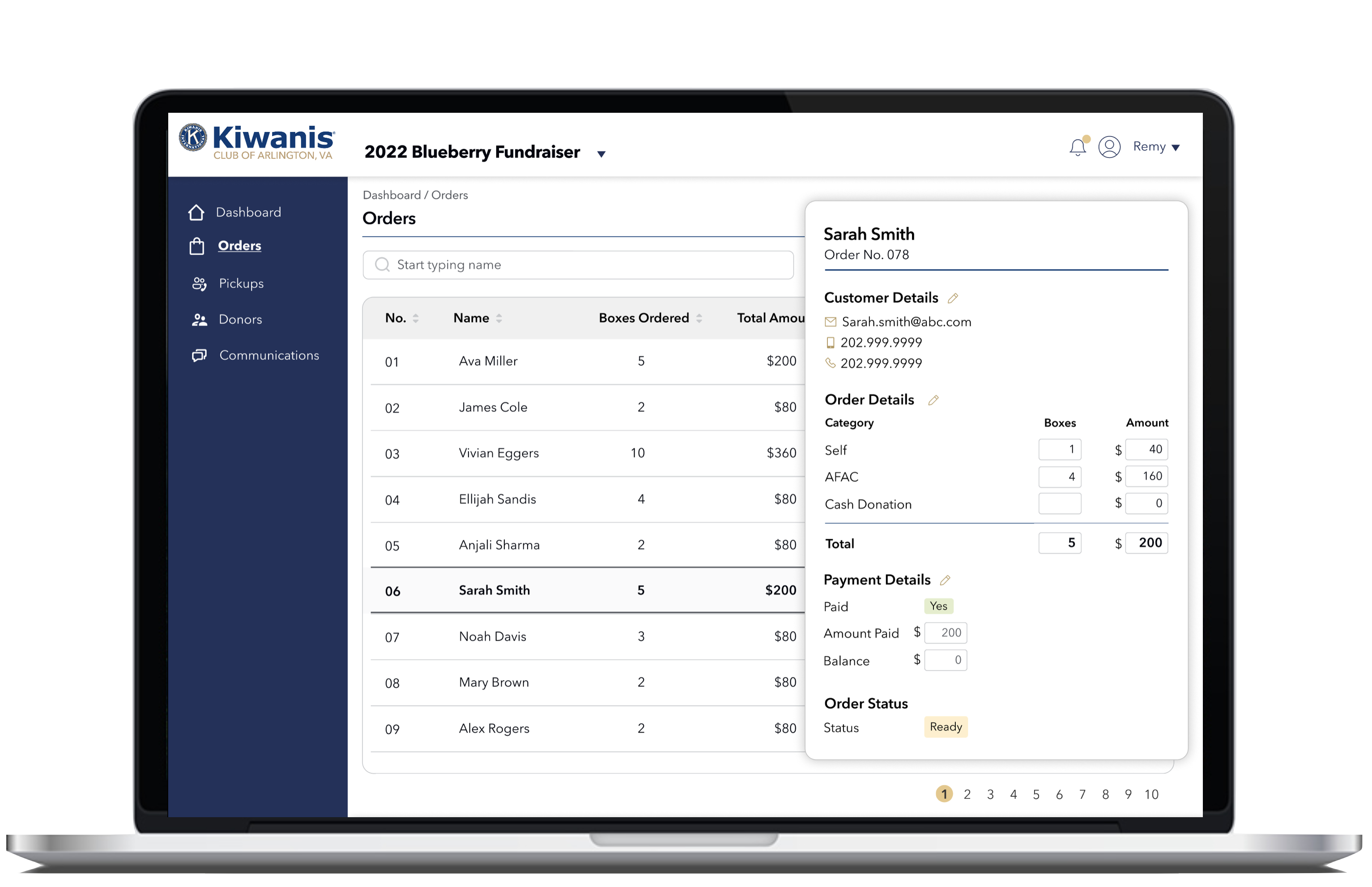
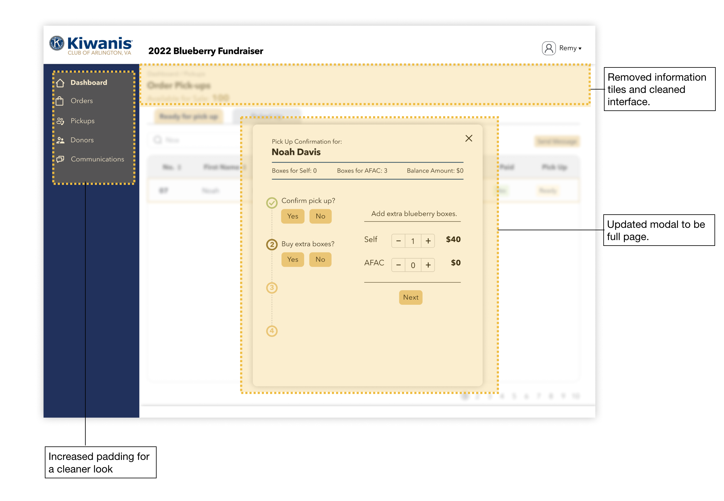
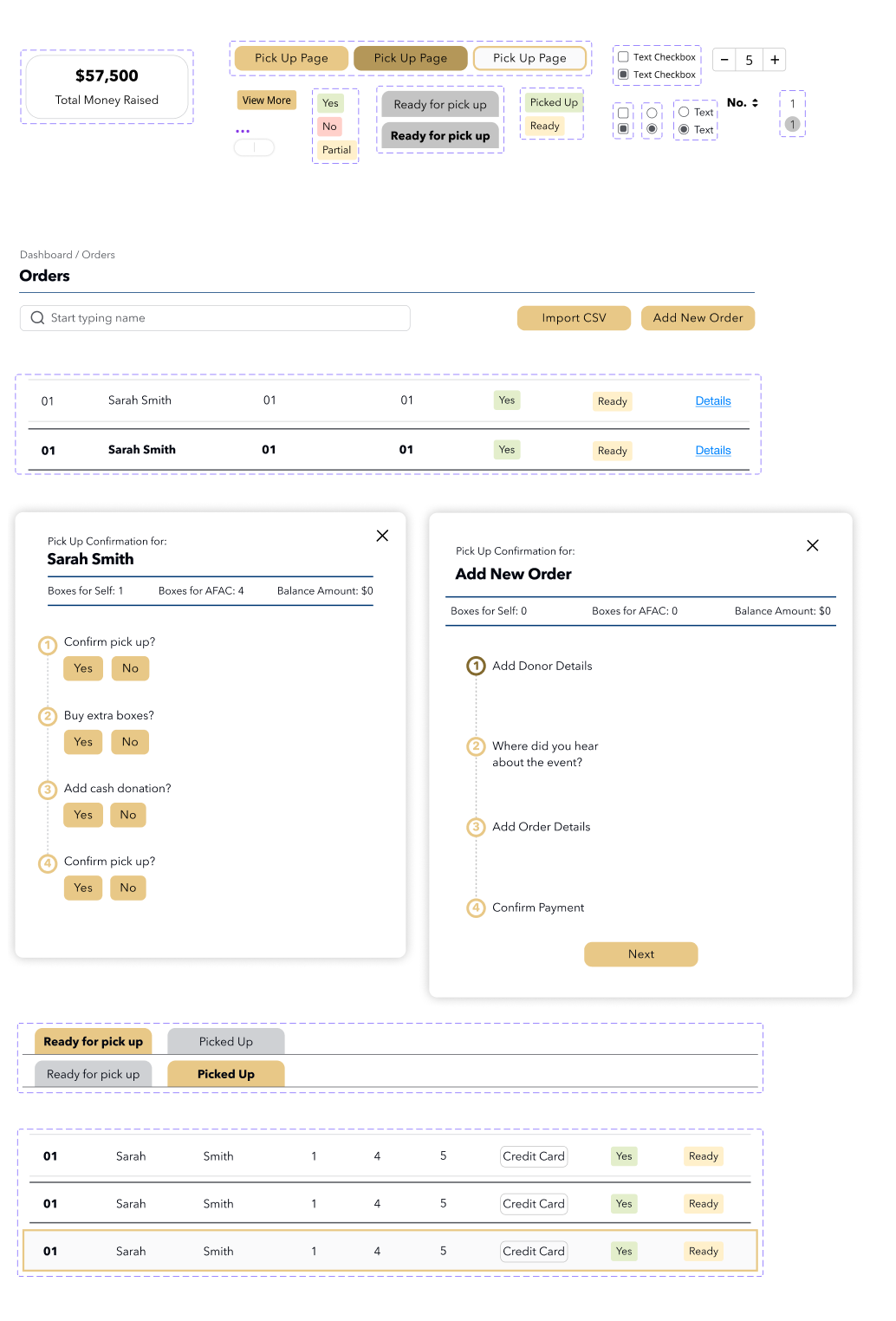
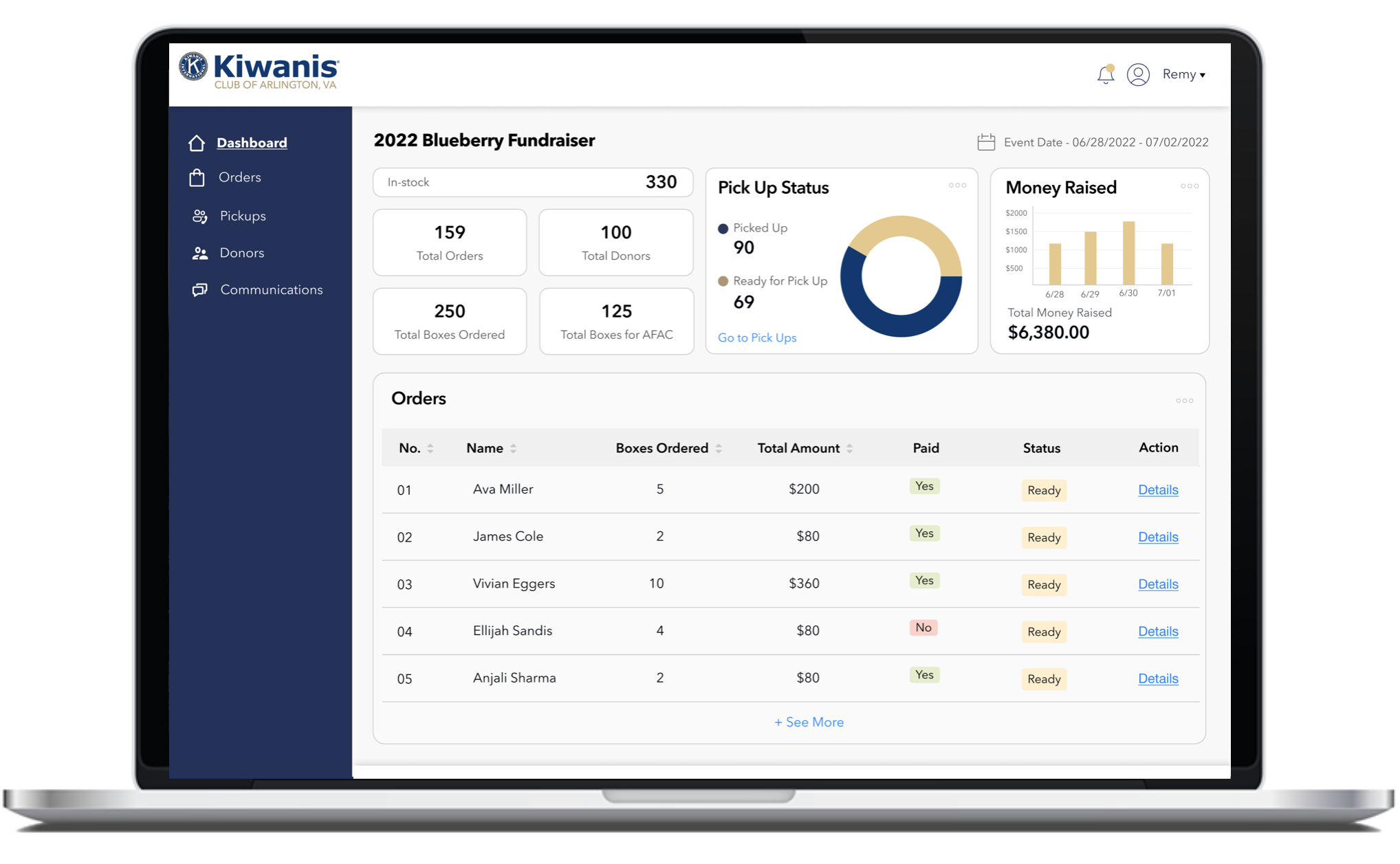
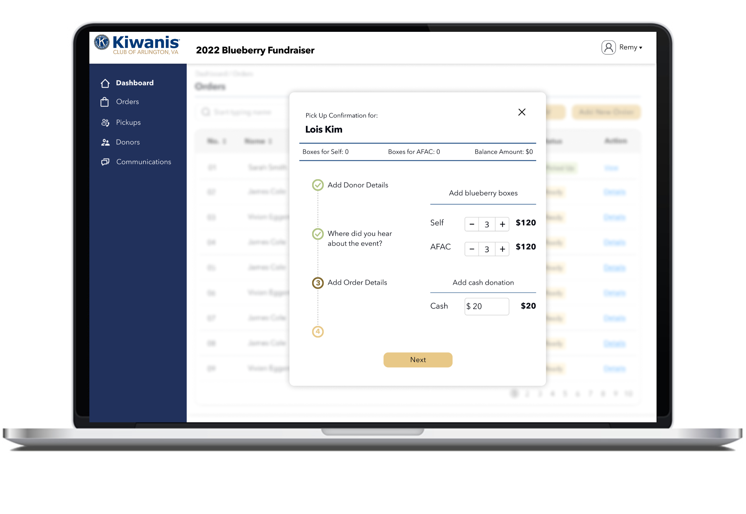
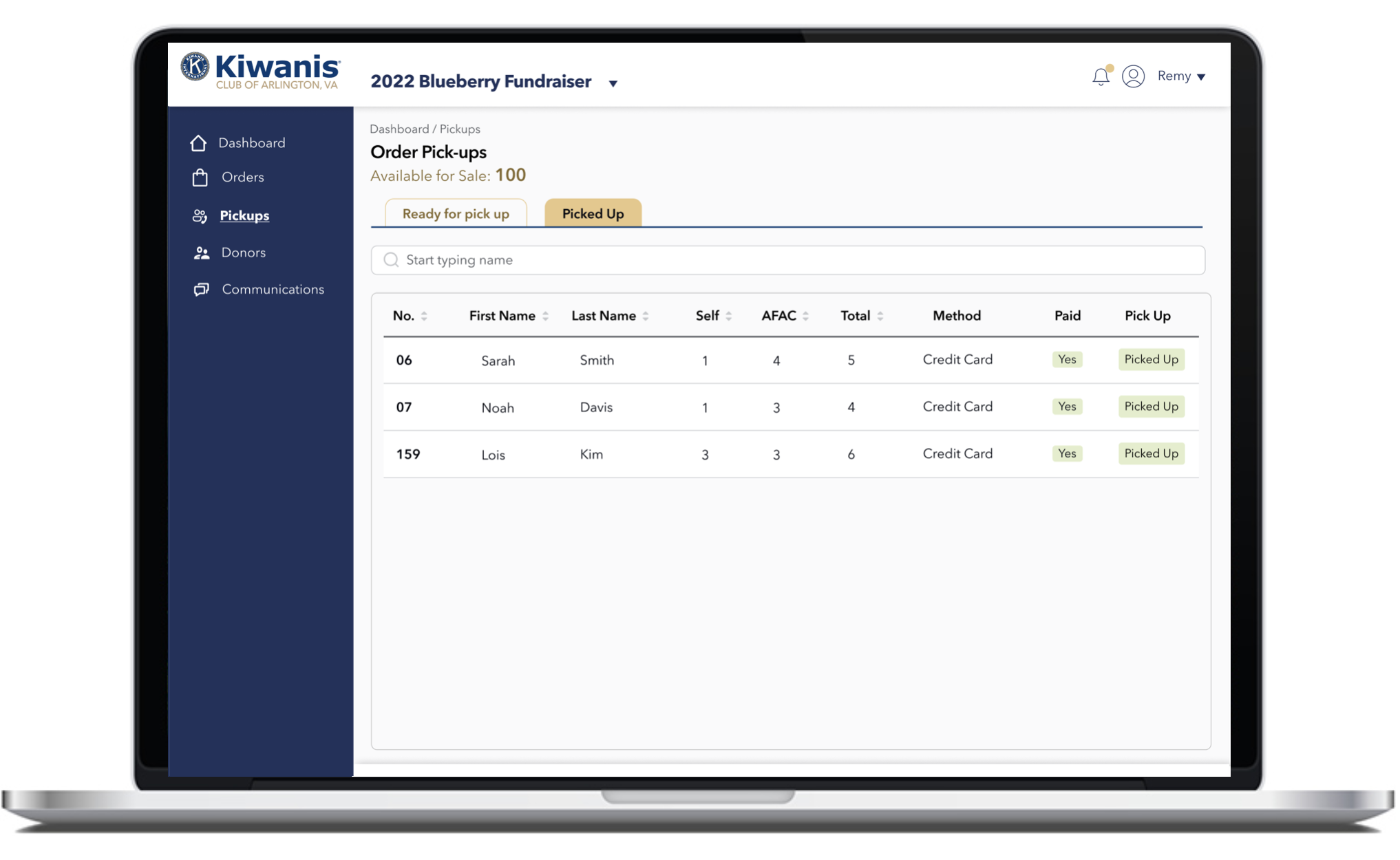
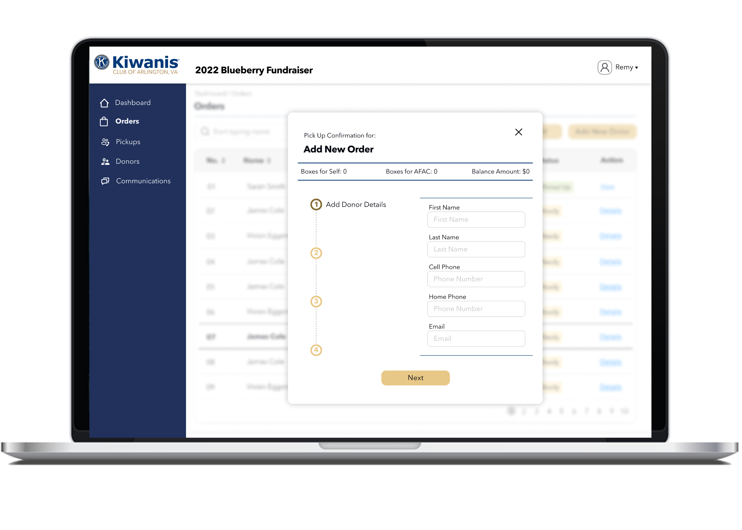
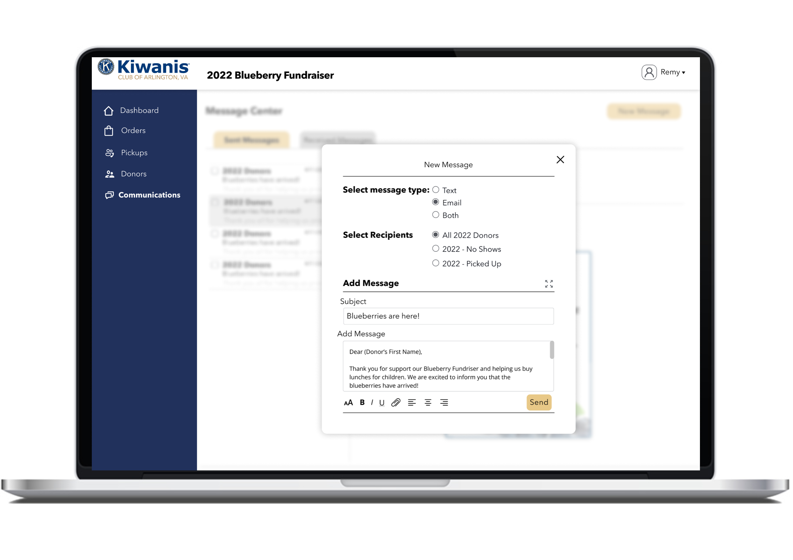
We were on a tight and a bit unpredictable schedule to deliver the dashboard. The fundraiser event is depended when the blueberries are harvested so we have to be a bit flexible with scheduling. Once the prototypes were ready, working with the developers, we had to re-access our deliverables. We redefined the MVP to provide the basic functionality of orders, pickups, and inventory. 

creating design systems

Typography

Color Palate

Getting together the Component Library

STEP 5 of 5 - GETTING FEEDBACK AND ITERATE

PAINPOINT
  • Users pointed out that some people drop by to buy blueberries during the event. They were wondering if they would be tallied in the count.
  • Users were wondering if they could revert back to order status.
  • Users wanted to incorporate various means of communication including home phone numbers.
RECCOMMENDATION
  • Add a button to custom add  new orders. Keep it consistent with the order form on the organizations website to make sure the database is consistent.
  • Provide options to edit orders and order status.
  • Add option to add home phone. Keep cell-phone as primary contact so that messages functionality will be activated on primary contact.

FINAL PRODUCT

LESSONS LEARNED

  • Continuously keeping in touch with the team to find scoping and budgeting issues.

As we were in a time crunch, I wanted to keep all the team members in the loop to show the directions we were going. I reviewed the designs with the team members multiple times and got the nod to go ahead.  But when the development started, I got a lot of pushback from the developers’ side. Their resources had depleted and hence were unable to get the project in time. We had to rethink and rescope the MVP to get the project in time.

  • Keep the design as modular as possible.

Based on the principles of atomic design, I created components from small to largest level. As they were nested within each other, making revisions and changing designs was quick and easy. This format takes additional time in the beginning but saves time in the longer run.